ShopDreamUp AI ArtDreamUp
Deviation Actions

Hello fontlovers!
Finally, after more than 2,5 years, here's a brand new issue of Fond of Fonts. In case you don't know: the purpose of this newsletter is to promote fonts and font creators across deviantArt. Because fonts are the best, most addicitve thing since chocolate cookies, but sadly also majorly underrated and in dire need of more attention.
New in this issue is the Groups section. In my absence, fellow fontfreaks started several type oriented groups you might like to join. If you know of any other groups that should be added, please leave a comment.
With that said, on to the features!
 jelloween
 FONT FEATURES

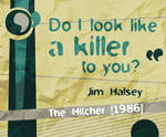
 :thumb182915339:


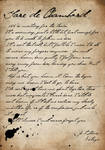

 :thumb194524704:


 GROUPS
Some type loving groups you might consider joining (if you haven't already (Smile)") ).
).


 PREVIOUS FoF ISSUES
+ FoF issue 4 - July 2008
+ FoF issue 3 - April 2008
+ FoF issue 2 - September 2007
+ FoF issue 1 - August 2007
Well, that's it for now. Suggestions, critiques and comments are always welcome!

Finally, after more than 2,5 years, here's a brand new issue of Fond of Fonts. In case you don't know: the purpose of this newsletter is to promote fonts and font creators across deviantArt. Because fonts are the best, most addicitve thing since chocolate cookies, but sadly also majorly underrated and in dire need of more attention.
New in this issue is the Groups section. In my absence, fellow fontfreaks started several type oriented groups you might like to join. If you know of any other groups that should be added, please leave a comment.
With that said, on to the features!
:thumb182915339:
:thumb194524704:
Some type loving groups you might consider joining (if you haven't already
+ FoF issue 4 - July 2008
+ FoF issue 3 - April 2008
+ FoF issue 2 - September 2007
+ FoF issue 1 - August 2007
Well, that's it for now. Suggestions, critiques and comments are always welcome!
Return from the dead
(!) - Awesomenessssssssss, my typeface Jesterday got a Daily Deviation! If you haven't already, come download it here. Thanks so much FantasyStock (https://www.deviantart.com/fantasystock)!
(!) - I've released the 5th issue of the Fond of Fonts newsletter. Read it here!
(!) - Download the Jesterday demo version here! Or support poor jobless little me and buy the full version at myFonts.com (with a 50% discount until March 26th).
Hey there!
Wow, it's been a reeeeeeeeaaaaaaaaally long time since I last posted a journal! Maybe 2,5 years? :omg: In case you're wondering, this is what happened:
1. I got a job
2. The job ate all my time and energy
3. I did not feel creative anym
Busybody
Hi!
I'm so sorry for neglecting dA and not posting anything for like, the past 4 months... I started a fulltime job as a Java Software Engineer and ever since I don't seem to have energy for anything but work anymore. Oh well, at least the work's lots of fun and I get paid plenty money :D Which is convenient since I am moving to a new house next week and have to buy all kinds of new furniture!
On a different topic, an increasing number of people has been ignoring my free font usage rules, which really does not make me happy. I supply these fonts for free and all I ask is for you to
not use them commercially without my permission (if you ar
Fond of Fonts! - issue 4
Hey there!
Last week was Stock and Resource Education Week! I had plenty of fun reading articles from and interviews with fellow resource makers. Unfortunately our little font gallery once again received far less attention than it deserves - even though bleedsopretty (https://www.deviantart.com/bleedsopretty) had a nice little interview with yours truly :) (it can be found here). So... about time for another Fond of Fonts newsletter!
I really hope you enjoy!
:heart: jelloween (https://www.deviantart.com/jelloween)
PS. Getting excited? Check out the links at the bottom of FoF issue 1 to learn how to dip your fingers into font designing yourself!
:bulletgreen: FONT FEATURES
:thumb89949463: :thumb84871607: :th
Summerplans and interview
(!) I've released the 4th issue of my Fond of Fonts newsletter. Read it here!
(!) For those who want to learn a bit more about me and why I make fonts: bleedsopretty (https://www.deviantart.com/bleedsopretty) interviewed me for Resources Week! Clickie for the interview. Also check out the other interviews and stuff at projecteducate (https://www.deviantart.com/projecteducate).
---
Hey all,
I am officially no longer a student, YAY! Last friday I finally got to defend my Thesis and as a result I am now the proud owner of a Master of Science title :D Good for me :) I thank everyone who supported me and sent me 'good luck' wishes :kiss:
With plenty of time on my hands I think I am going to participate in the awesome
Featured in Groups
© 2011 - 2024 jelloween
Comments9
Join the community to add your comment. Already a deviant? Log In
Hey, ik vroeg mij af of je interesse hebt om Temple-of-Typefaces in de volgende post te vermelden?
Neuton verdient naar mijn mening ook extra aandacht, mocht je weer een grote font feature willen doen.
Ik las overigens zojuist dat je fan bent van Lucas de Groot. Mag ik vragen waarom specifiek Lucas de Groot? Ik heb zelf andere lettertype ontwerpers als idolen, maar wat ik mooi vind aan de lettertypes van Lucas de Groot is het teveel aan gewicht dat hij vaak in curves gooit om het een subtiele humanistische uitstraling te geven.
Ik heb toevallig mijn lettertypes aan Gerrit Noordzij kunnen laten zien. Verder heb ik Petr van Blokland eens gemailed maar hij heeft nooi iets terug gestuurd. Heb je overigens 'The Stroke' door Gerrit Noordzij gelezen? Met name voor lettertypes met schreef is dit een mooie theorie om eens gelezen te hebben. Het heeft mij in ieder geval nieuwe inzichten gegeven en een aantal concepten voor nieuwe lettertypes.